DMI Direct Metals
Case Study
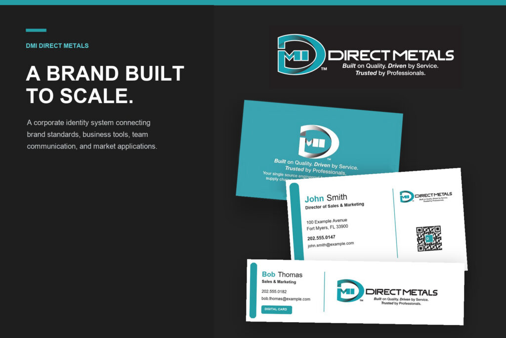
DMI Direct Metals needed a corporate identity that could keep pace with a growing team, a broad roofing-industry audience, and an expanding range of business and market applications. The system had to feel established and industrial while remaining clear, flexible, and easy for employees, vendors, and partners to reproduce consistently.
I helped develop the corporate rebrand and turn it into a scalable identity system spanning logo exploration, brand standards, business cards, email signatures, messaging, tagline development, and related brand applications. Rather than ending with a new logo, the work gave DMI a coordinated set of standards and templates for everyday communication and future brand extensions.
Role
Brand identity and graphic designer working across logo development, visual standards, production systems, team communication, messaging, and brand rollout.
Scope
Logo exploration and refinement, corporate identity standards, color and typography systems, business cards, branded QR integration, email-signature templates, messaging and tagline development, production-ready brand assets, and product or market brand-extension concepts.
Challenge
DMI needed an identity that could work consistently across print, digital communication, employees, vendors, partners, and future product applications. As the organization grew, relying on isolated logo files and one-off layouts would make the brand increasingly difficult to control. The new system had to establish a recognizable industrial presence while remaining practical for everyday use by different people and production partners.
Approach
I explored visual directions connected to metal, building systems, movement, and direct service before developing a compact DMI mark with a strong corporate presence. A teal, charcoal, and white palette reinforced the industrial character while providing reliable contrast across light, dark, print, and digital applications.
I organized the finished identity into practical standards covering logo variations, color usage, typography, tagline placement, and icon applications. Business cards and email signatures were then developed as repeatable team templates, giving each employee a consistent information hierarchy while supporting QR and digital-contact access.
Messaging and tagline development connected the identity to DMI’s core value story: quality, service, trust, and roofing-industry expertise. Related naming and lockup concepts demonstrated how the corporate system could extend into focused products and market applications without losing its connection to the parent brand.
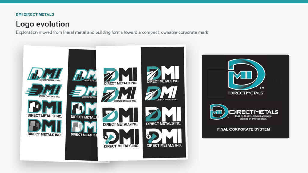
Logo Evolution
Early concepts explored literal building forms, metal profiles, directional movement, and industrial hardware. The final direction distilled those ideas into a compact DMI mark that remained recognizable across corporate lockups, small icons, print applications, and digital environments.
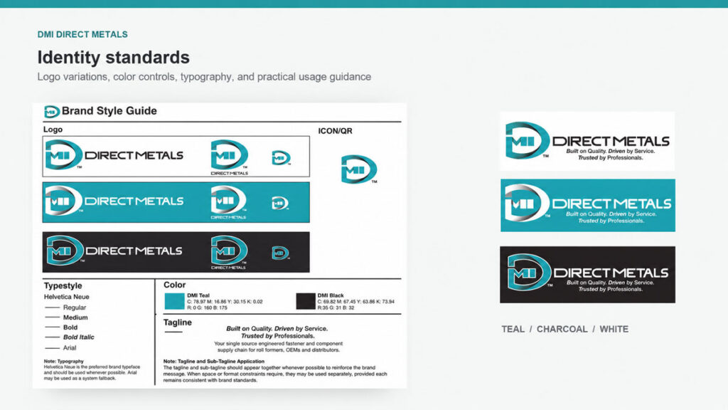
Identity Standards
The brand guide organized logo variations, color specifications, typography, tagline placement, and icon usage into one practical reference. Teal, charcoal, and white created a controlled palette that supported both standard and reverse applications across different production settings.
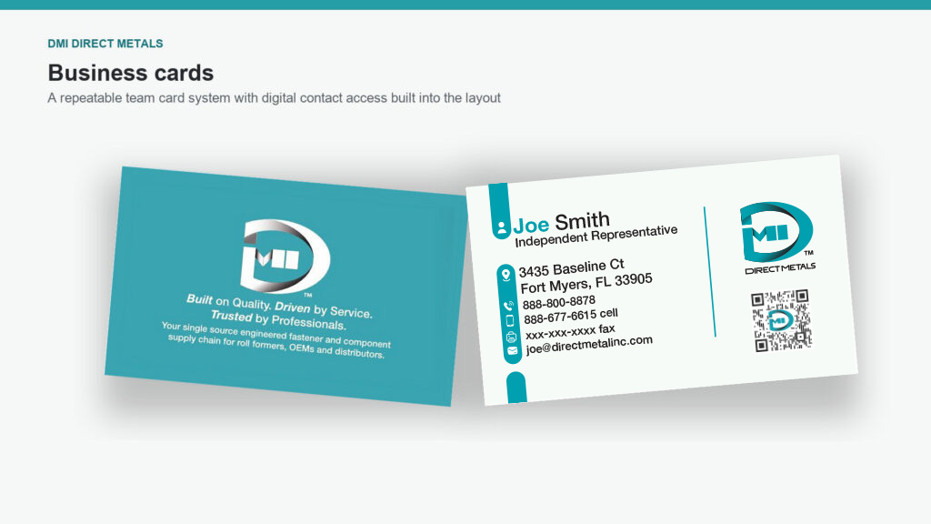
Business Cards
The business-card system provided a repeatable template for a growing team. Clear contact hierarchy, branded QR access, and a strong reverse-side message connected the professional introduction with DMI’s positioning and digital follow-up tools.
Email Signature System
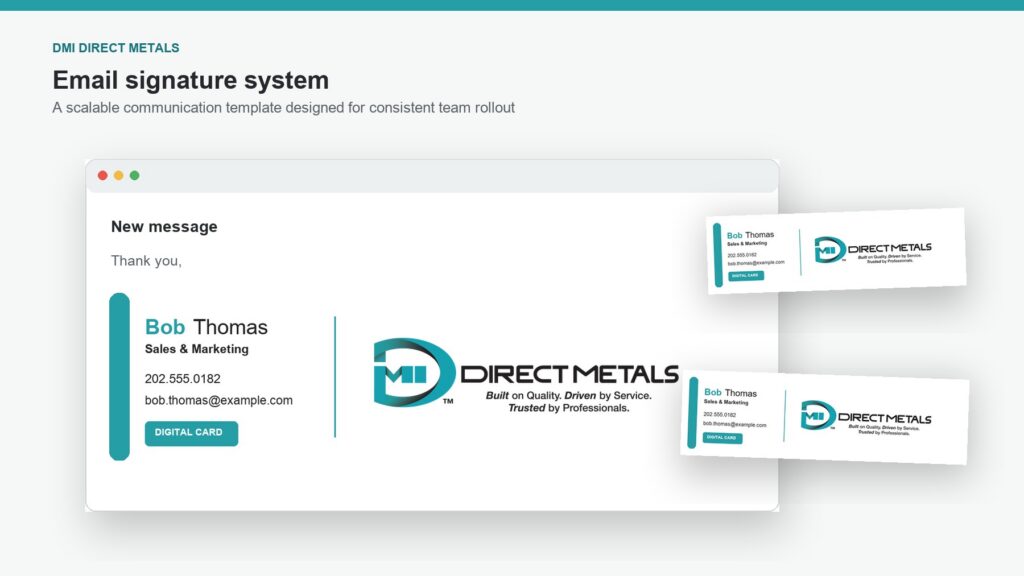
The email-signature system translated the identity into a scalable team communication template. It balanced employee information, digital-card access, and corporate branding while keeping the signature compact enough to support everyday correspondence without overwhelming the message.
Messaging and Tagline
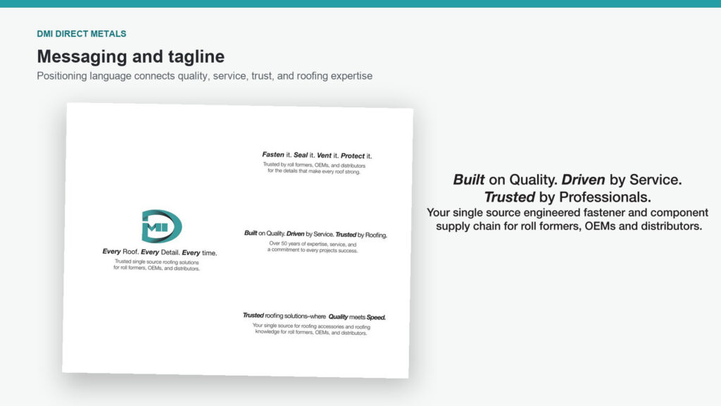
Messaging exploration focused on DMI’s strongest business themes: quality, service, trust, roofing expertise, and single-source support. The final positioning—Built on Quality. Driven by Service. Trusted by Professionals.—gave the visual identity a clear and repeatable market-facing voice.
Brand Extensions
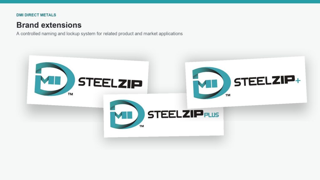
Exploratory naming and lockup concepts demonstrated how DMI could extend its corporate identity into focused product and market applications. Shared typography, color, and the DMI symbol maintained a clear relationship to the parent brand while allowing each extension to establish its own name.
Outcome
The project produced a flexible corporate identity system that could be distributed and applied consistently across DMI’s day-to-day communication. Instead of relying on isolated artwork and one-off layouts, employees, vendors, and partners gained a coordinated toolkit of standards, templates, and production-ready assets.
The system gave DMI a more recognizable and professional market presence while making future applications easier to develop. Its shared visual and messaging framework created a practical foundation for team growth, ongoing communication, and related product or market extensions.
Let’s Talk
Need a designer who can connect brand, marketing, web, and production? I’m available for remote roles, contract partnerships, focused freelance projects, and ongoing creative support.
Tell me what you’re building, where the communication is getting stuck, or what your team needs help finishing.