ST Fastening Systems
Case Study
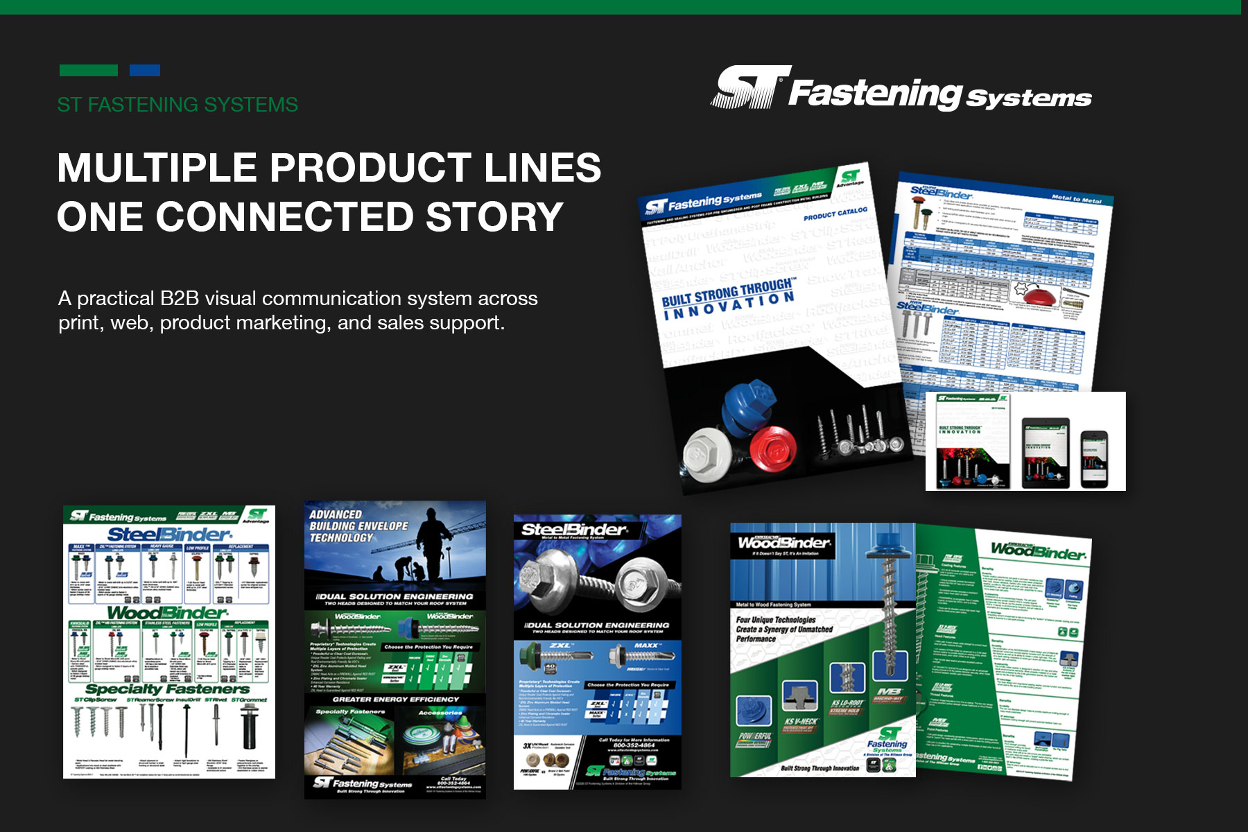
ST Fastening Systems needed a clearer way to present a broad, technical product offering—including fasteners, sealing systems, accessories, color-matched finishes, and corrosion-defense technologies for metal building applications.
I helped develop the company’s evolving brand identity, corporate logo system, product family identities, and branded technology marks. From that foundation, I created a connected communication system spanning catalogs, line cards, sell sheets, web graphics, trade advertising, color charts, displays, and sales-support materials. Together, the work gave distributors, customers, and internal sales teams a clearer and more consistent way to understand and communicate the product offering.
Role
Brand identity designer, graphic designer, and marketing creative working across corporate identity, product branding, campaign development, print, web, product education, and sales support.
Scope
Corporate logo development, product family and technology identities, brand architecture, product catalogs, line cards, sell sheets, website graphics, print and digital advertising, product-positioning campaigns, color charts, displays, trade show graphics, and sales-support materials.
Challenge
ST Fastening Systems offered a broad, technical product line encompassing multiple fastener families, coatings, head styles, applications, warranties, and performance technologies. The corporate brand, product families, and named innovations needed distinct identities while still feeling like parts of one connected system. The communications also had to make detailed comparisons easy to understand across print, digital, display, and sales-support formats.
Approach
I organized the brand and communication system around a clear hierarchy: corporate identity, product families, performance platforms, individual technologies, and supporting proof points. I helped develop and refine the corresponding logo systems, then carried that structure across the marketing materials through bold product imagery, strong category headers, technical callouts, comparison tables, consistent color coding, and repeatable brand cues. This gave buyers and sales teams a faster way to recognize each product, understand its advantages, and see how it fit within the larger ST Fastening Systems offering.
Brand Identity & Product Architecture
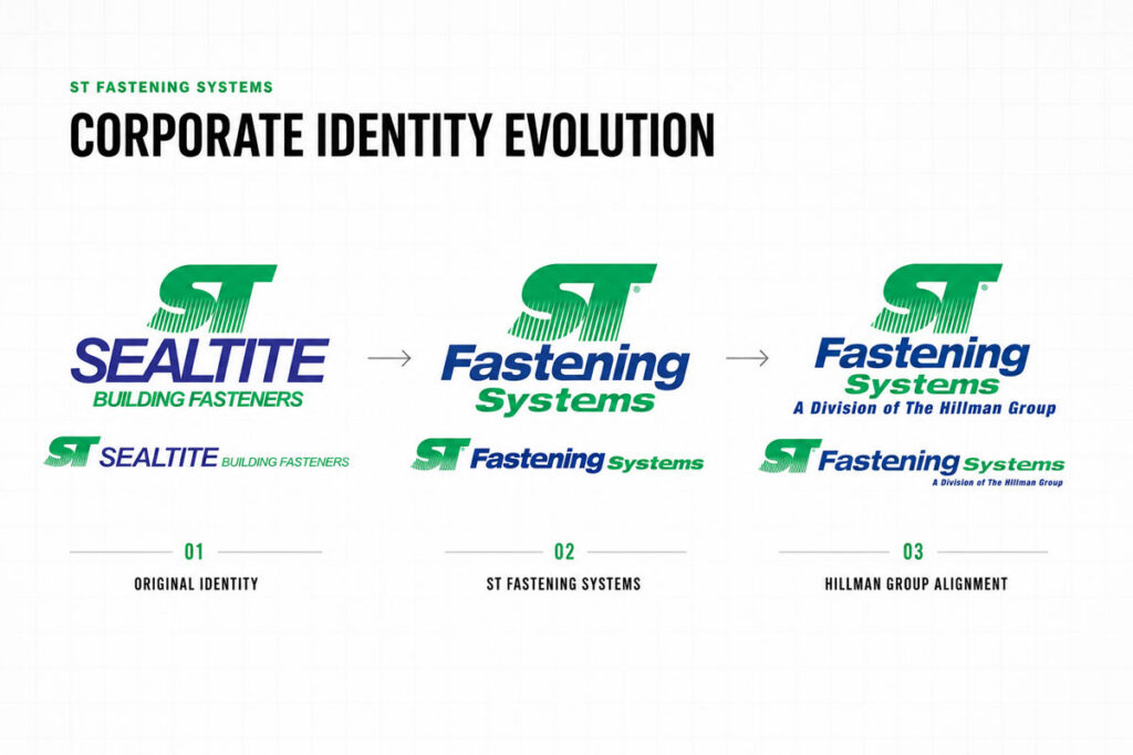
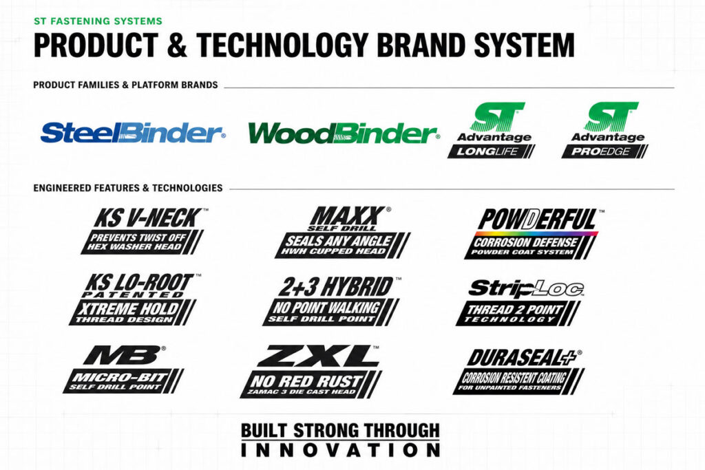
The identity system had to connect the ST Fastening Systems corporate brand with distinct product families, performance technologies, coatings, and competitive advantages. I helped develop and refine the corporate logo system, establish identities for SteelBinder and WoodBinder, and create a family of branded technology marks that turned technical features into recognizable, marketable product stories.
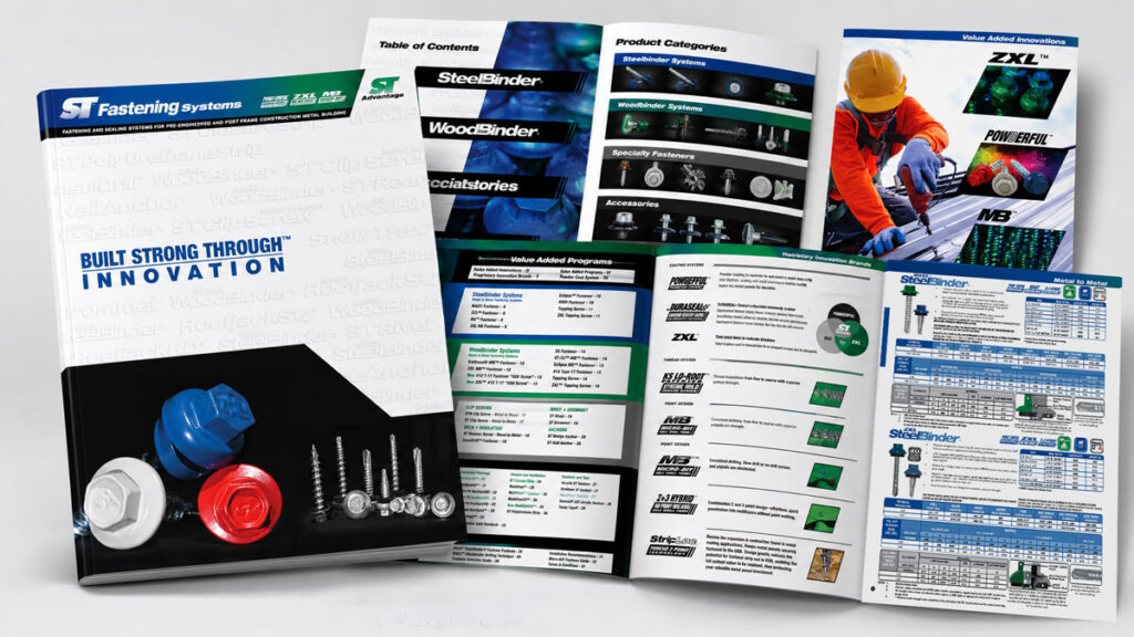
Catalog
I organized ST Fastening Systems’ broad product offering into clear families, application categories, comparison tables, and visual reference points. Consistent hierarchy and product coding made detailed technical information easier to scan, turning the catalog into a practical tool for sales conversations, product selection, and specification.
Sell Sheets
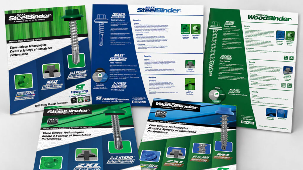
Each sell sheet gave an individual product or system a focused sales story. Product imagery, benefit led hierarchy, application details, coating information, and competitive proof points helped representatives explain what made each product different and why that difference mattered to the buyer.
Website and Digital Support
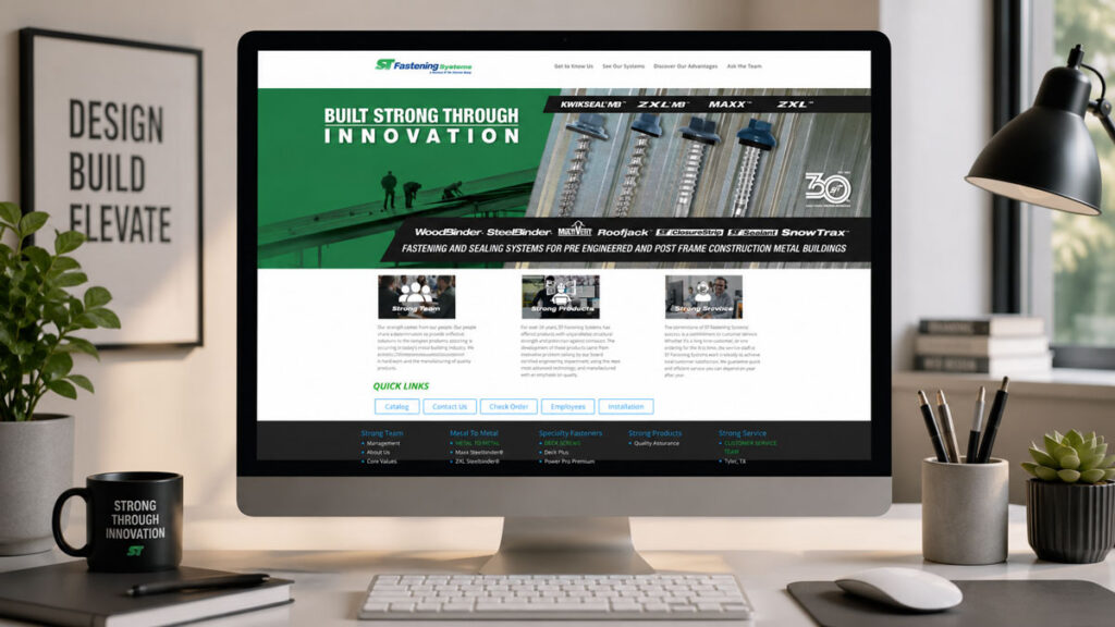
I extended the brand system online through homepage graphics, product family visuals, campaign features, and access to downloadable literature. The digital work connected brand positioning with practical product navigation, giving customers and sales teams a consistent experience across web and print.
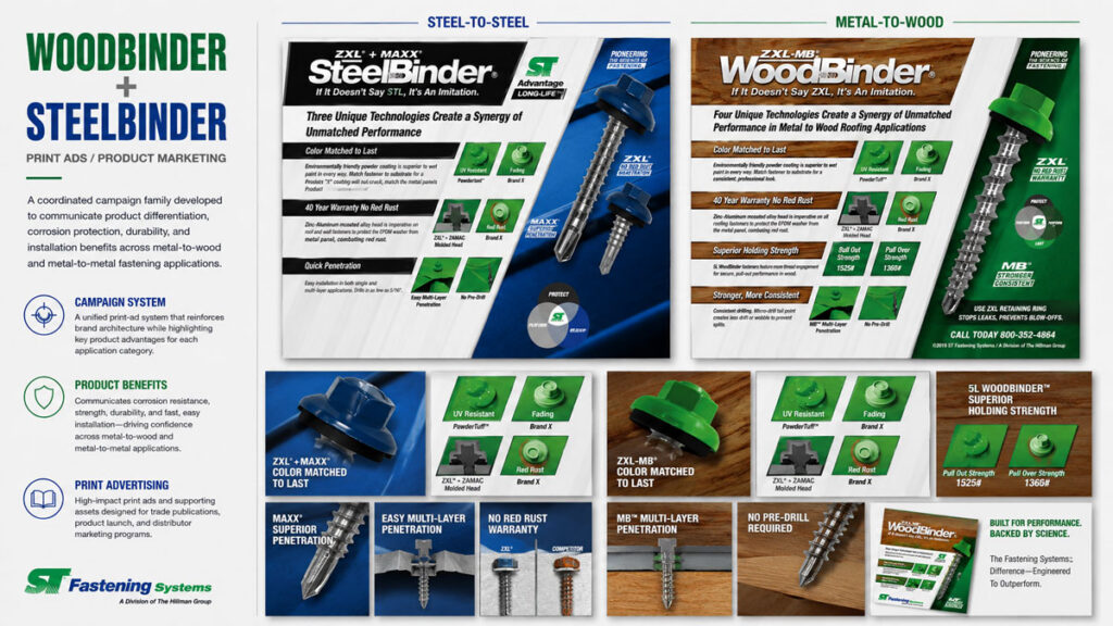
Ad Campaigns
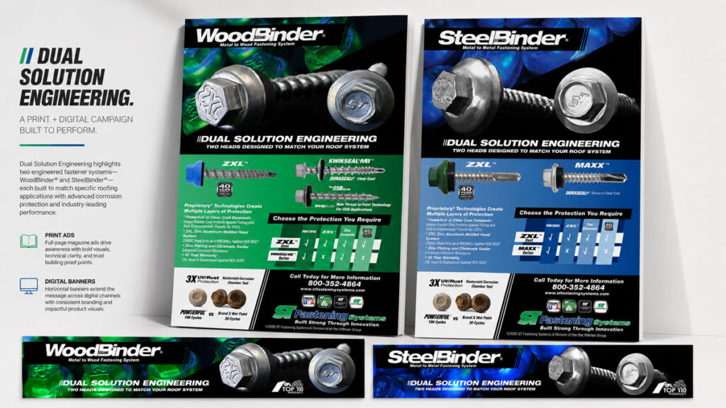
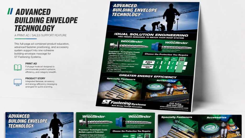
Print and digital campaigns turned technical product advantages into concise, memorable concepts. Themes such as Dual Solution Engineering and Advanced Building Envelope Technology combined product comparisons, application benefits, and corrosion-defense messaging for trade audiences.
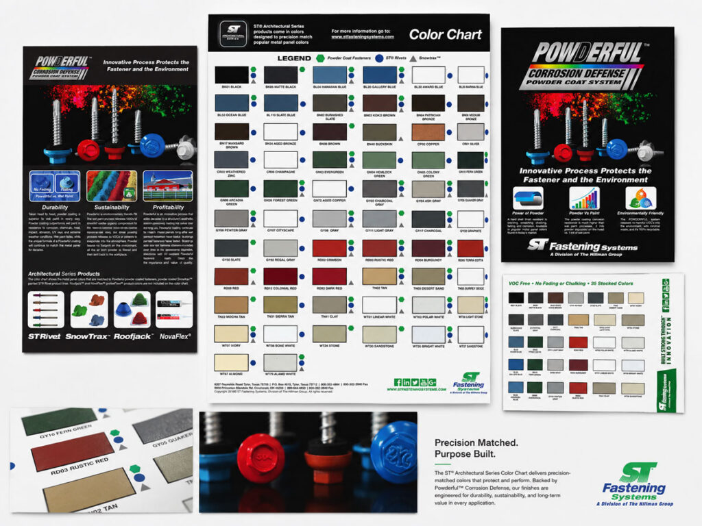
Color Charts
The color chart connected a functional product-selection tool with the Powderful corrosion-defense story. It brought color matching, finish education, durability claims, and physical samples into one organized system—helping customers choose confidently while reinforcing the value behind the coating technology.
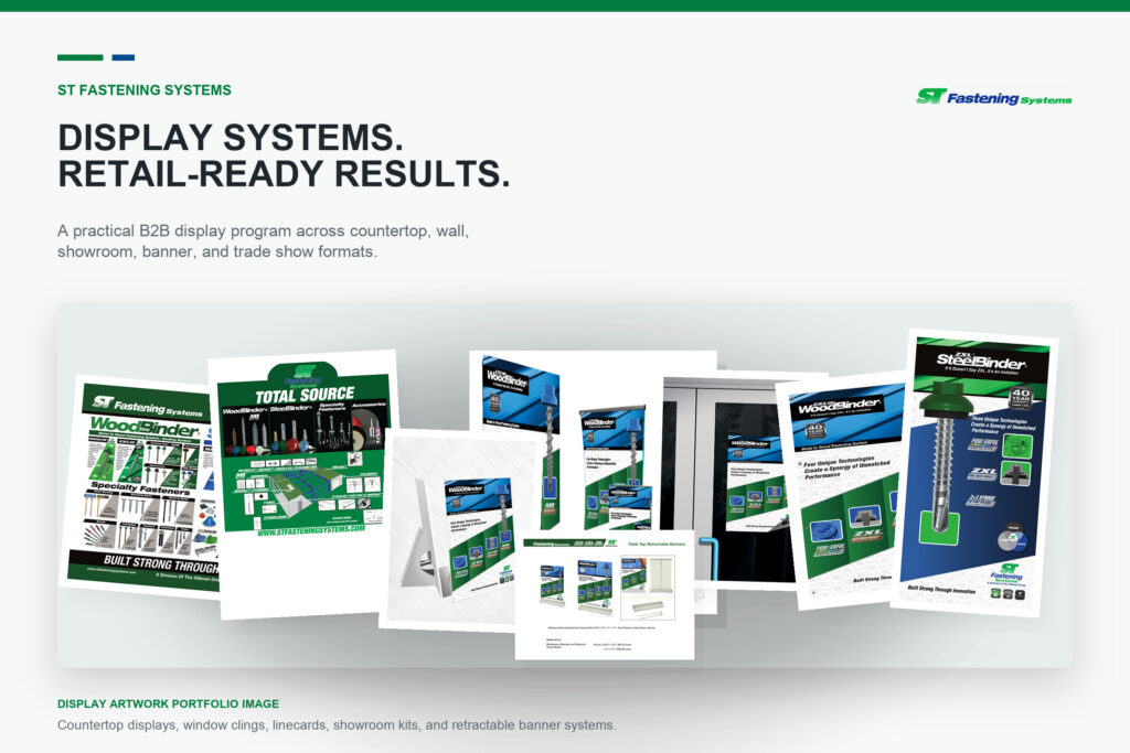
Display & Trade Show Graphics
I carried the brand system into countertop displays, window graphics, wall line cards, showroom materials, indoor banners, and retractable trade show displays. Consistent imagery, hierarchy, and brand cues made the broad product offering easier to recognize and explain across a variety of physical environments.
Outcome
What began as a series of individual marketing needs developed into a durable brand and communication system spanning corporate identity, product branding, print, digital, display, and trade channels. The system gave ST Fastening Systems a practical toolkit for launching products, explaining technical advantages, presenting the breadth of its offering, and supporting more consistent sales conversations.
The identities and visual framework remained flexible enough to extend across new product technologies, campaign concepts, and the company’s later alignment with The Hillman Group. Together, the work reinforced ST Fastening Systems as an organized, recognizable, and engineered fastening and sealing brand. During the years this communication system supported the brand, ST Fastening Systems grew from approximately $15 million to $70 million in annual sales.
Let’s Talk
Need a designer who can connect brand, marketing, web, and production? I’m available for remote roles, contract partnerships, focused freelance projects, and ongoing creative support.
Tell me what you’re building, where the communication is getting stuck, or what your team needs help finishing.